

I really haven’t forgotten that I use this blog for watercolor sketches and fountain pens in general. Today was my last day of a week’s leave. Time really flies by when you’re having fun. I also realize that blogging, drawing, keeping up with social media takes a huge amount of time, but it’s an investment that I really enjoy. Well, I’m digressing from my subject again…
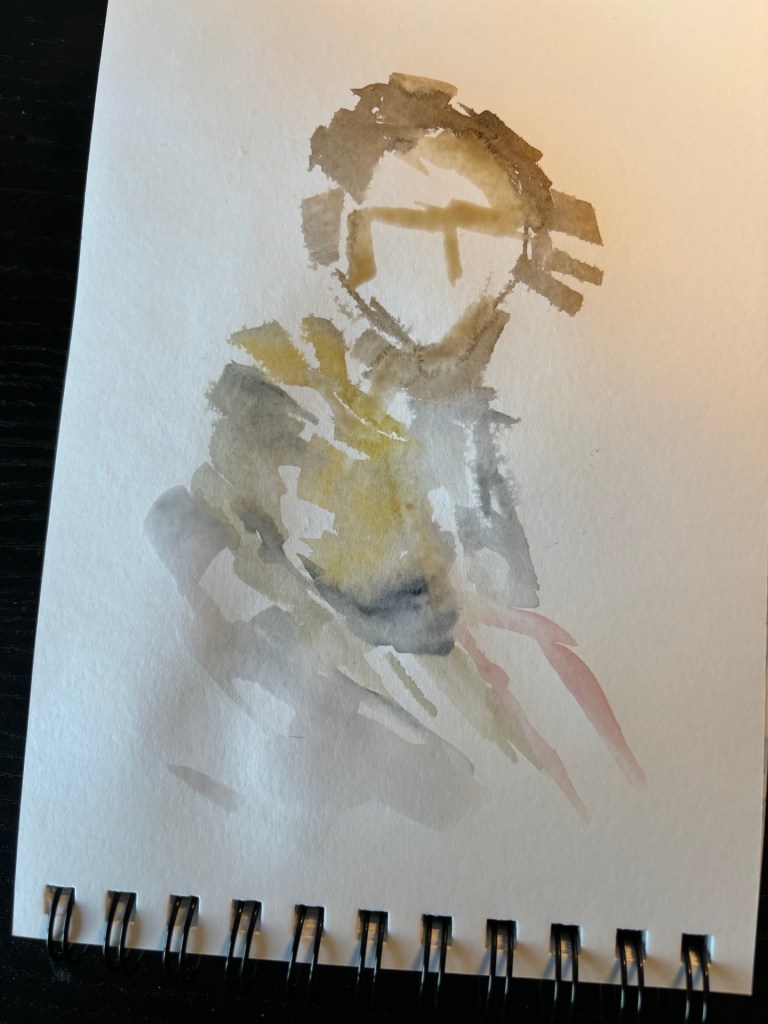
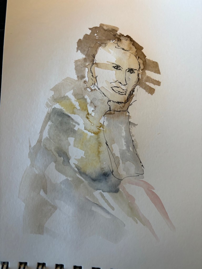
After following another very pleasant class from Toby Haseler (tobysketchloose) on Skillshare, I found the courage to try this out today. The method used now differs slightly from what I normally do. First, a layer of water colour is laid, a first wash, wet-on-wet. Yes, you can already guess that the colours are already getting a free flow here and are starting to do their thing. On top of this, the basic sketch is drawn with water-resistant ink with, in my case, a fountain pen.
The principle remains loose sketching. Finally, the details are added, colors become more intense and the fountain pen completes the sketch. I add the splashes to make it a bit more abstract, more playful.
As for loose sketching, it sounds fun and has a low barrier to entry, but don’t underestimate it. Being loose however does mean that there must be a plan of action and the strokes of the pen must be correct. With urban sketching there is a fairly large margin of error, by which I mean that you can easily correct mistakes but also that mistakes are less noticeable. This is completely different with portraits…
The first sketch I made is from google maps, Gentbrugge (Be) the town square of the city where I grew up. I’m pretty satisfied with the sketch. I recognize the village square immediately. The colours could perhaps be a little more ‘natural’. I hesitated to add some parked vehicles, but in the end I didn’t.

The second sketch is a portrait. I’m attaching some pictures of the build-up. This one is not easy but I am not really dissatisfied with the end result. I’m not jumping in the air with enthusiasm either, but the dreaminess of the lady and the sitting position do appeal to me. The simple, pale pastel colours emphasise the dreaminess.
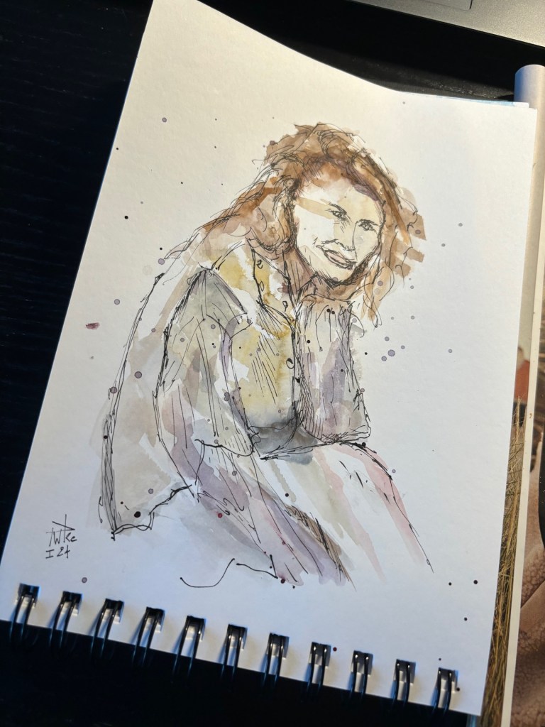
I know and realize that I still have a long way to go to have even better results. Sometimes I take two steps forward, but every now and then there are a few steps back. But I do make sure that I enjoy it and that there is a certain evolution.
Today is Friday, ‘working’ weekend ahead, but first enjoy a dinner with the family, take care of yourselves!

Leave a reply to graysummers Cancel reply