Here we go

Published by

on

Now that the typical New Year’s rush is over, the best wishes have been sent and the family visits have brought back nice memories, time to go back to work. Right, I was sketching portraits to let the hands, fingers and eyes communicate with each other again. Often it is a bit of a search for inspiration, but suddenly it is there.

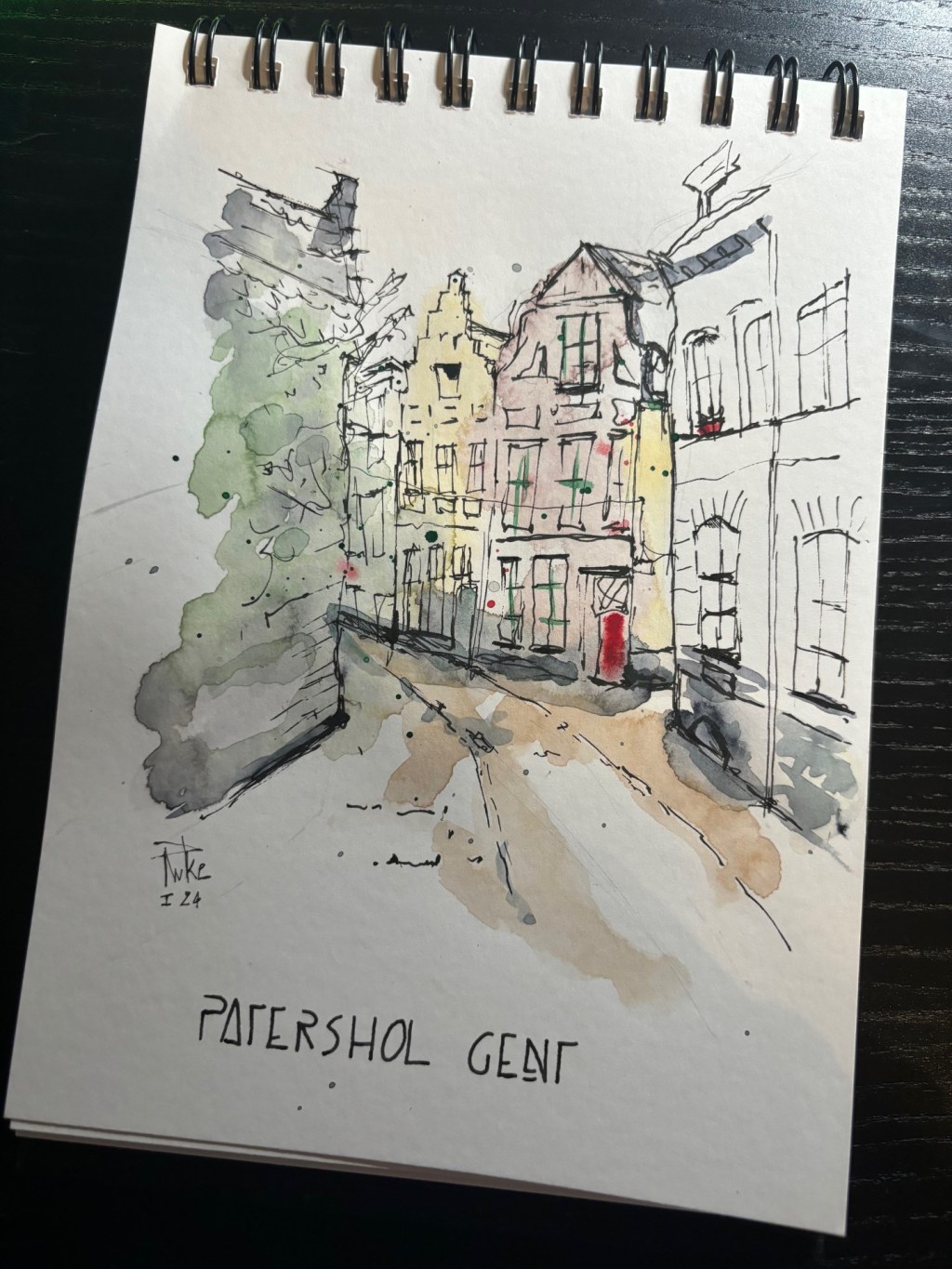
I saw a photo of an urban setting appear on Reddit, asking where in Ghent this was. Well, the photo was taken in ‘Patershol’ in Ghent, more specifically at the intersection of Haringsteeg and Hertogstraat. Patershol is a historic medieval corner in the center of Ghent with a number of nice places to eat. Now, I’m not going to teach history here… as a real ‘Gentenaar’ (resident of Ghent) I often go there, which is why I quickly recognized the photo.

When I saw the picture I immediately thought: I’m going to make a watercolor sketch of it. And that’s what I’ve just done, you can ‘admire’ the result. Now I’m still a beginner when it comes to watercolor sketching. Of course, there is still a lot of room for improvement and finding the right colors. I have tried to depict the coziness of this street, but also to leave enough white (negative space). It is important to mention that the sketch is made in a loose way, so not everything is measured and the caliper has not been used. The most important thing for me is that it is recognizable and that it breathes an atmosphere. Tips are of course welcome 🙂

7 responses to “Here we go”

  1. graysummers Avatar

    It will be good to see your images over the coming year. They have an ‘individually yours’ identity already. Your mention recently of the ink and watercolour combination is pretty inspiring to be honest. Cheers Pascal.

    Liked by 1 person

  2. Pascal (peacockpens.com) Avatar

    Thanks Gray. Adding a certain identity will be a long process, but the determination is there. Greetz!

    Like

  3. Danny Watts Avatar

    You have done an admirable job. Better than anything I could do. I like it a lot. The amount of white space is good, the colors are good. The only issue, if you don’t mind a minor critique is where the street bends the corner – the greenish color spills over to the build across the street resulting in a lose of the corner of the building. It blends into one building.

    Liked by 1 person

    1. Pascal (peacockpens.com) Avatar

      For sure I don’t mind about any critique. I know what you mean about the greenish colours. When I did the sketch I thought of Toby Haseler’s (tobysketchloose) words that you have to let the water colours do their work and that we are not supposed to colour within the lines, in the end it is a loose sketch. I revisited the sketch taking your comment into account. The fact that the colors go outside the lines is part of loose sketching. I should have added more contrast and shadow to create depth, I’m sure I can see that. The greenery on the front building is actually planting, a shrub. Now in my sketch I didn’t emphasize this enough by maybe drawing some branches and leaves with black ink. Still, thank you Danny for your comment, at the end of the day, one should be able to handle positive criticism. I believe that the learning process is a long slow curve, with the intention of seeing them evolve in the right direction. Best regards!

      Liked by 1 person

      1. Danny Watts Avatar

        I am familiar with the concept, I thought that edge might have included trees or bushes. I was thinking more like this. Colors are for emphasis.

        image.jpg

        Liked by 1 person

      2. Pascal (peacockpens.com) Avatar

        Yes indeed, question myself how far can loose be loose if you know what I mean. Some basic ideas such as contrast, light and shadow can’t be neglected. Also I’m aware that not everybody see the things like I see them, take into account I know the place I sketched. I take this with me . Thank you, cya!

        Liked by 1 person

      3. Danny Watts Avatar

        I enjoy your work and have done similar work to help pay for my schooling – I get it. art work is personal and everyone sees things differently. Glad I could be of assistance.

        Liked by 1 person

Leave a comment